About the client.
Udemy is an online marketplace for learning and teaching where people from all around the world are mastering and developing new skills to achieve their goals and change their lives.
The Brief.
Udemy approached us to design a new product feature to extend on their current online learning platform, to reach a new market. They are primarily engaged in the business sector and had identified a gap in the market to reach primary, secondary or tertiary students because they’d noticed parents wanting to give their children an advantage via non-traditional education.
My Role.
Working within a team of three user experience designers, from the outset we agreed to work together from end to end to ensure that each member would have an opportunity to contribute and that we would be on the same page at each point of the process.
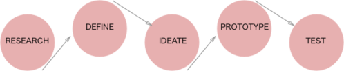
Research
To gain a better understanding of the existing Udemy business and existing solutions in the market we did some preliminary research by creating a feature inventory to analyse competitors.
The analysis confirmed that there was an opportunity to target primary school age learning as there were not a lot of easily accessible resources already existing.
We then conducted user interviews from which we gained some valuable insights about the use of rewards to motivate children to learn, and the need for accessibility on different devices.
Kids really lack motivation, it is all about the rewards
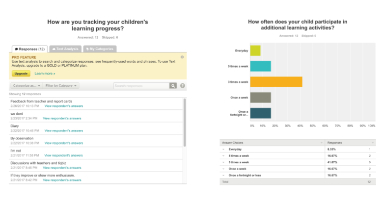
We also conducted a survey to reach out to a broader network of parents and obtain more quantifiable information.
We were able to receive responses quickly by reaching out on social media.
The surveys revealed:
- Majority of children regularly participate in extra curricular learning
- Children’s learning progress is not being tracked
By synthesising all our research findings and insights into an affinity map the key problems became clear:
- Parents need their children to be engaged with their learning
- Parents need their children to feel good about learning
- Parents and children need to track learning progress
Define.
Using the key findings and to highlight the main user problem for us to solve, we formed a problem statement:
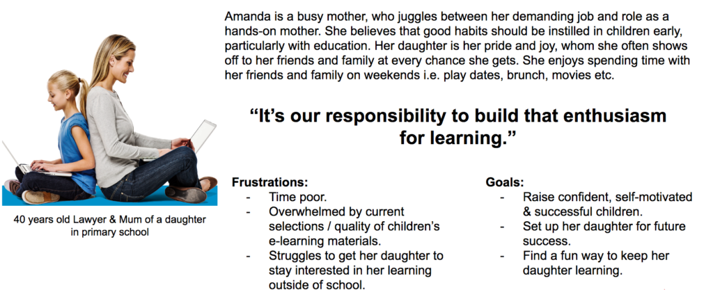
Amanda needs a way for her child to be engaged with extra learning materials because she wants her to maximise her capabilities.
We explored some ‘How Might We’ questions and a solution began to emerge, which we formed into a hypothesis:
We believe that by adding a new product feature to Udemy for parents, which rewards primary school age children, a better engagement with extra curricular learning will be achieved.
We will have demonstrated this when we see a 75% completion rate of children’s courses within 6 months.
From here we defined our key target user, which formed our persona, Amanda:
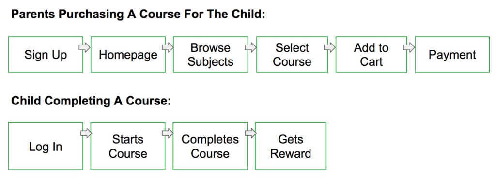
We created two key user flows to demonstrate the ideal pathway for our user to use our product.
- Target user purchases a learning course
- User’s child completes a learning course with the reward on completion
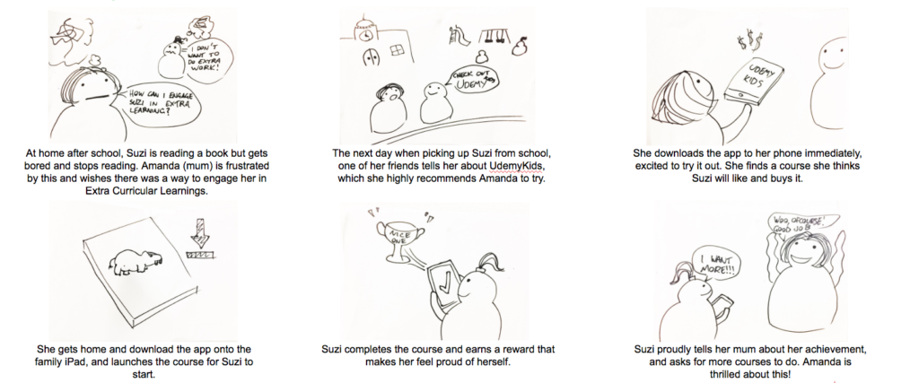
To illustrate how our solution could be incorporated into a scenario for our persona, Amanda, we created a storyboard.
Ideate.
Initially envisaging a responsive website for our solution, we then created a site feature list to prioritise features and establish the structure of the site Information Architecture.
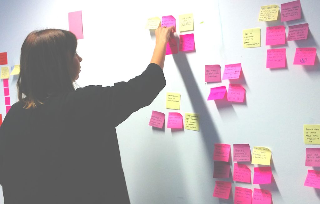
We performed a card sorting exercise using post-it notes to quickly test and identify with users their main priorities in our features.
Three top priorities were very clear from the results:
- YEAR LEVEL
- SUBJECTS
- LANGUAGE (TRANSLATION)
A low priority item for users was a peer community feature we had wanted to include, and with time constraints in mind the team agreed to cut it from the design.
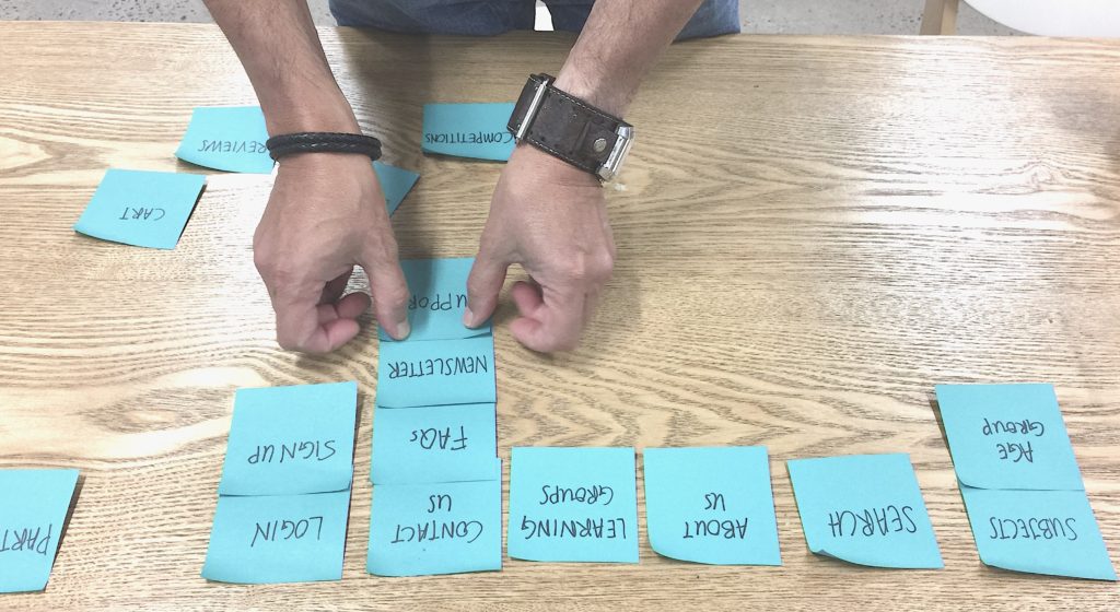
There was no clear pattern in priorities for the remaining features which prompted us to revisit our research.
User research and data analytics had shown:
- iPads are a commonly used device for kids
- 63% of Udemy’s current users access the Udemy platform via the mobile app
At this point it was clear that we needed to pivot and focus on designing a mobile app rather than a responsive website for our target user and their children.
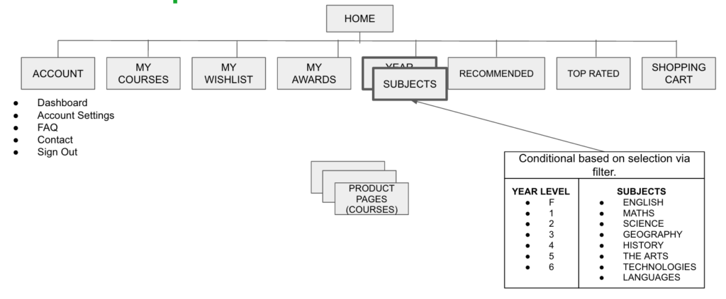
With limited UI real estate to consider on a mobile app I conducted more card sorting to refine the site map and determine the order and prominence of visible features on the Home screen of the app, with which we refined our site map and could move onto prototyping and testing.
Prototype.
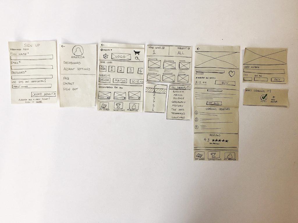
We created paper prototypes to test of our key user flows (iPhone & iPad). Since we were working in a Lean environment with a goal to generate an MVP that could be used on multiple devices, using paper prototypes allowed us to test and iterate quickly.
Mobile experience (iPhone) first prototype iteration:
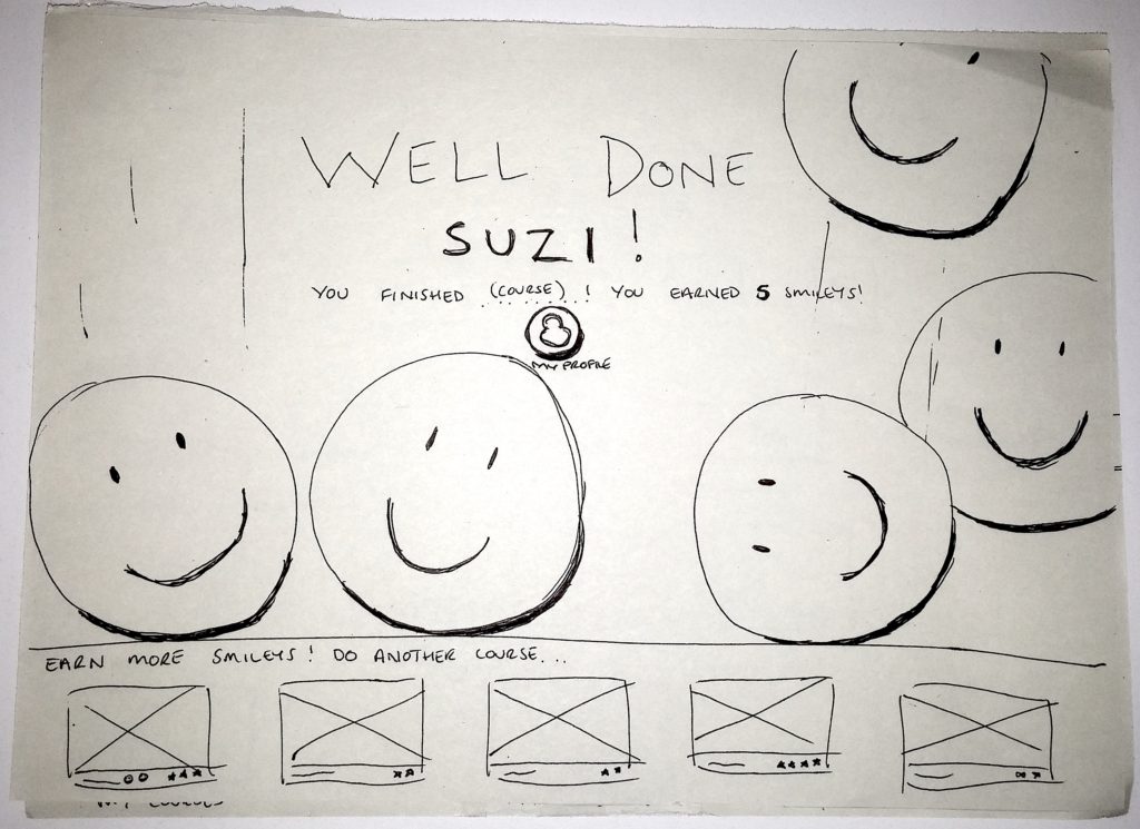
Before beginning the iPad prototype I initiated a Design Studio session with the specific intention to generate ideas for how the rewards screens on the app would look. This element was crucial to our solution so I wanted the team’s ideas and input.
Using the best elements of each person’s ideas we agreed on a rewards solution which I then sketched onto paper, which included an animated screen upon course completion.
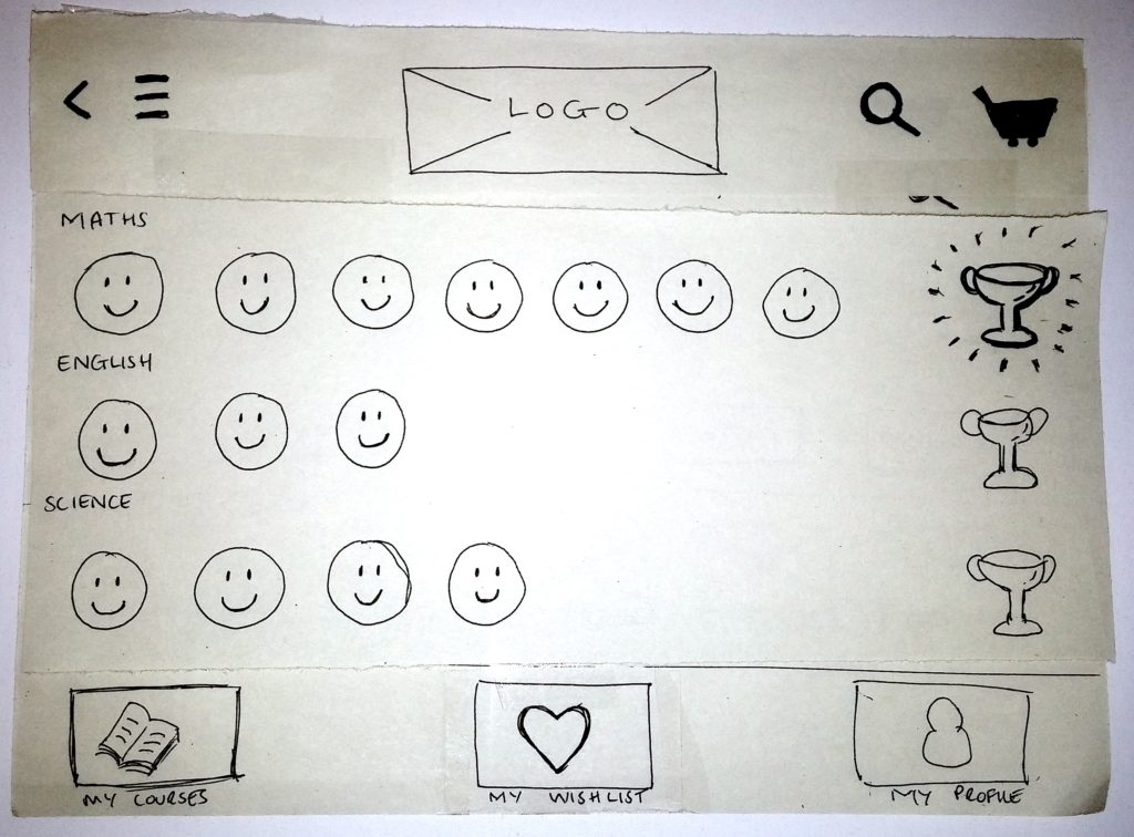
I created the iPad prototype to test our second user flow, the key flow demonstrating how the child will engage with the learning materials.
Test.
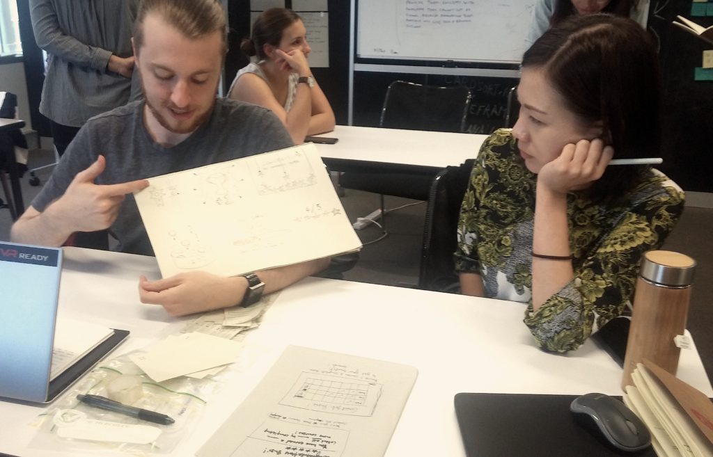
We tested both prototypes on users who best matched our Persona and made changes accordingly based on feedback.
The usability testing sessions were incredibly insightful, where our assumptions about our design iterations were validated and it helped us reach our final output.
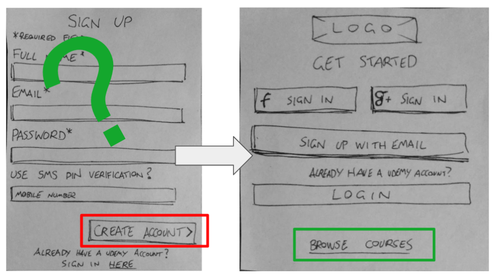
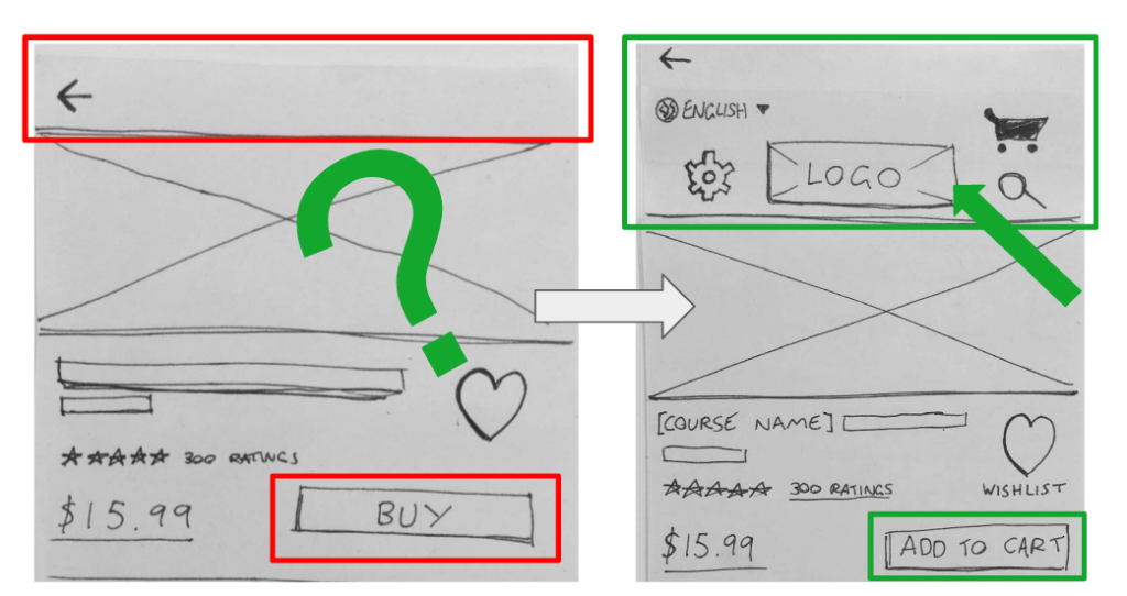
In total, 5 iterations with some of the key changes to the mobile login and home screens that were made based on feedback from the testing pictured below:
Key issue found in testing:
- Users want to be able to browse course immediately before signing up for anything.
Solution:
- Add a button/hyperlink to allow for browsing courses before creating an account.
Key issue found in testing:
- Users want to buy multiple courses rather than only one per transaction.
Solution:
- Added a cart feature, changed “Buy” to “Add to Cart”, prompt users to add to cart instead of prompting payment straight away
Results / Final Output.
Two low fidelity prototypes to demonstrate the key user flows for the Udemy Kids app.
Mobile experience (iPhone):
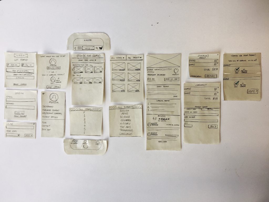
Tablet experience (iPad):
Clickable paper prototype here https://invis.io/BMAONFYG9
Next Steps.
Based on our research and testing, our team envisages many opportunities to further develop Udemy Kids, and as such we made a number of recommendations to the client, including to test the rewards system on primary school age children, to truly validate that it would engage them in this learning. Ideally this would be done with higher fidelity mock-ups.
Key Learnings.
- The team found that time-boxing and a structured plan was the best way to ensure that we continued to move forward in the project and meet the deadline.
- Personally, I valued being in a team with two designers with differing backgrounds and experience. Seeing two different approaches to tasks and problems broadened my perspective.
- The project re-iterated how important taking an open and collaborative approach and attitude to problem solving in UX Design is. It was this shared mindset from each of our team members which saw us design a simple, and effective solution.