YLab Learning
YLab is a global social enterprise of the not-for-profit FYA (Foundation of Young Australians) which connects driven, passionate, young people between the ages of 18 and 30 with government organisations and the social sector to work on projects towards changing and creating better processes and systems to build a better future.
The Brief.
YLab needed to improve the way in which they delivered the online learning component of their YLab Associate program that helps train young people to become ready to work on these Systems Change projects.
My Role.
I was team Lead and facilitator, and was the main point of contact with the client.
Throughout the project I contributed to all aspects of the process, which included conducting user interviews, competitor analysis, ideation via design studio session, wireframing, A/B testing, prototyping in Axure, usability testing, and presentation to the client.
The Design Thinking approach our team took was:
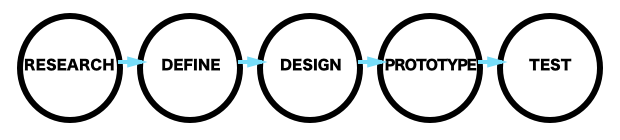
Research.
We spent one and half weeks researching to gain an understanding of YLab’s goals and their current solutions, potential areas of opportunity for the online learning program, and most importantly to understand students’ (the users) experiences and motivations in regards to online learning.
We conducted a competitor analysis by listing and comparing the structure and features of several well-recognised online learning platforms, each team member focussed on one to two competitor platforms to ensure this exercise could be done quickly and collaboratively.
The exercise revealed that YLab’s program already has a unique advantage over other programs due to it being delivered through a combination of both in-person and online methods.
Some features which competitors use well that we could look to incorporate into the online platform included quizzes, progress tracking and the availability of accredited courses. But it stood out that there was an opportunity for YLab with peer-to-peer interaction.
As part of our user research I also analysed some survey feedback given by students who had completed the current online learning component of the Associate Program, noting the key issues and pain points.
I organised and facilitated several user interviews with YLab Associates, over Skype and phone conversations as most were based in Sydney. We also recruited and conducted interviews with some non-YLab young people who matched the YLab Associate profile.
From the survey analysis and user interviews it was clear that students learn and engage better when they are able to interact more with the content, their peers and instructors, and this was something we would consider to take forward in our design somehow. Pain points included difficulty or lack of functionality using communication platforms provided with the learning program.
Define.
To formulate the key findings from the research into a clear problem to focus on, we synthesised all the key insights via affinity mapping and constructed our problem statement:
Ashley needs ways to effectively engage with the YLab community and the course content to get the most value out of the learning experience.
Each team member explored some possible ways to address this problem by writing a series of How Might We questions, and voting on the best of these we formulated our hypothesis to test:
We believe that a collaborative, team-based course structure and learning environment will enhance the learning experience and better prepare students to deliver successful system change consulting projects.
We will know this to be true when:
Student self-assessments throughout the course indicate desired/increased progress/learning;
The YLab Design team assessment of the readiness of Associates for client projects improves;
There is an improvement in the student NPS (Net Promoter Score) for the YLab Learning program and the YLab organisation.
Our persona was a representation of the key user, a potential Lab Associate, based on the research we had done. Our client engaged really well with the persona as it illustrated clearly for them on paper who their key user was.
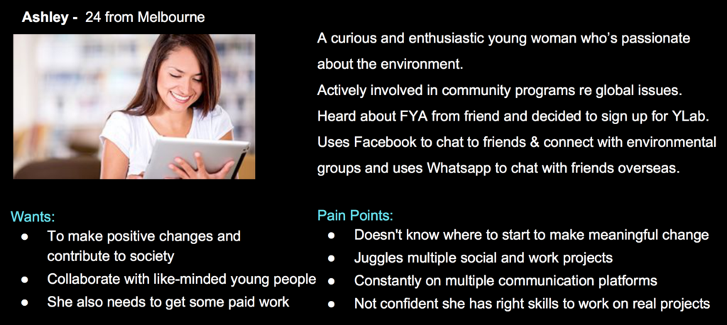
I outlined a high level linear User Flow for Ashley, to illustrate and focus her experience with our design.
Sharing the Persona, the main problem, and the hypothesis with the client to engage with our process and design, and put trust in us from an early stage.
Design.
To visualise what the online learning platform would look like I ran a Design Studio session with the team.
We did three timed rounds of quick sketching and at the end of each round, shared our ideas and critiqued each other’s.
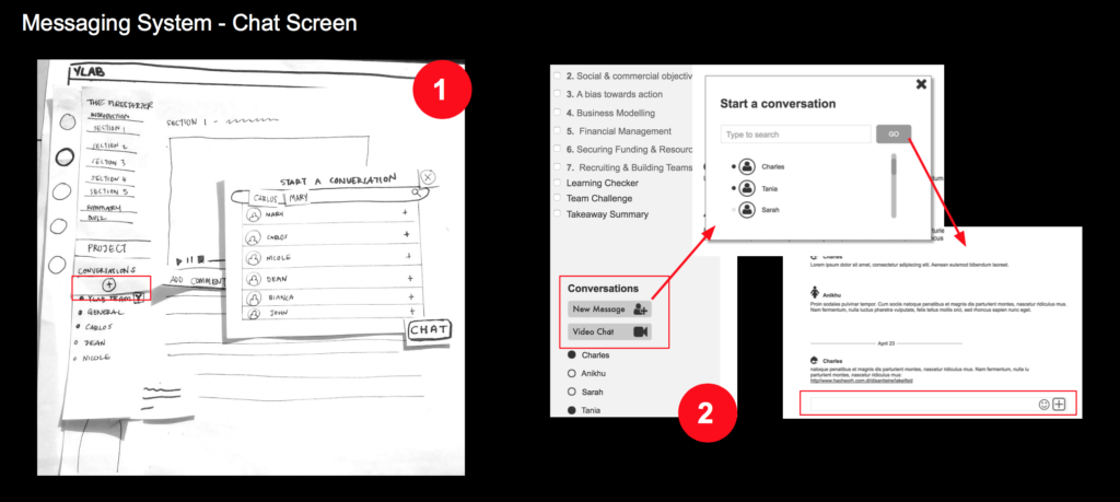
We decided that the best design idea was an all-in-one platform, similar to a combined LMS and messaging (e.g. Slack) format, with key features including: chat/messaging, video conference, commenting on content, dashboard/schedule. This would allow the busy users, the future Associates to conduct their learning and communications with each other easily and in the one place.
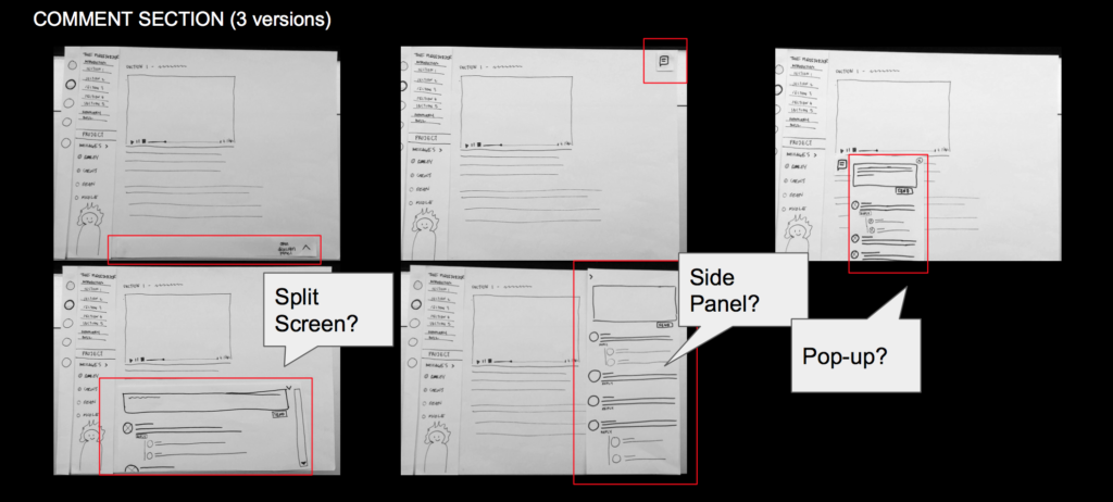
A key element to our design was the comments section in each learning module. As a team we had come up with four variations but couldn’t agree on which was best. So together with one of my team members I conducted some A/B testing with users to determine which style of comments section layout they preferred and was going to be the most effective.
This was a fast and successful way to come reach a decision, and we were all happy with the results and outcome which was a fly-out side window for comments.
Prototype.
Once the wireframes were created and the team was happy with the basic layout, we allocated key screens between team members to build them in Axure. I worked on the main interface screen where the navigation to lessons and communication options would be in a sidebar, and the windows and screens for starting a chat session, and also for a video conference.
These formed two of our key user flows which we would later test.
Working on different screens separately meant that we had to amend each person’s design slightly so that they all matched together in style when we combined them into the one prototype. This took more time. A style guide/kit before building the prototype screens separately would have been beneficial so that each of us used the same elements and style.
Test.
We needed to test the functionality of our design, in particular the ease of use and likability of each of the key features. Would students want to use this while learning and would it encourage them to engage with their peers more too?
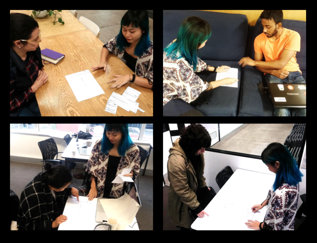
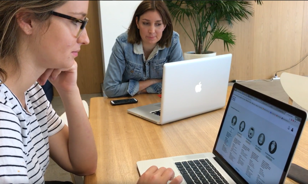
We tested our prototype iterations with people who best matched our Persona, including some YLab Associates, I had earlier recruited and users for test sessions. I knew it would potentially be difficult to lock in participants if left too late, particularly as our user was typically a very busy young person working on multiple projects in various locations at any given time.
For each test session we assigned someone to facilitate, someone to take notes and someone to record.
Key Learnings.
I learned that value we were able to add in this project came largely from the insights we were able to give to the client from our research. We were able to clearly validate some of their assumptions, whilst also shedding new light on the current learning platforms used, and about the users (YLab Associates). Combined with the competitor and comparative analysis, we were able to provide strength in argument and clarity for the client to take the next steps in developing their training program and towards getting approval from the Board in the broader organisation.
A memorable moment was showing the client a short clip of one of the user tests during our prototyping stage. We could clearly see that we had achieved total buy-in from our client to our design direction which was based on all our hard work in the Research phase.